①
Room Scenes
Healthcare corridors, school hallways, and hotel lobbies showing wall protection, corner guards, and handrails in context—not isolated product cutouts.
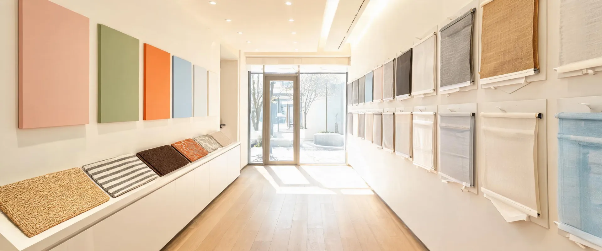
Browse room scenes, material combinations, and trend spotlights that help designers and facility teams visualize specialty products before samples arrive.
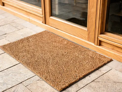
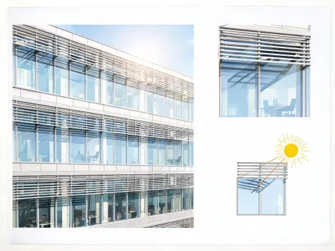
This gallery translates Construction Specialties systems into visual stories: color pairings for Acrovyn walls, entrance flooring textures that greet guests, and sun control rhythms that keep façades calm. Each board is curated for designers who need to defend finish choices in owner meetings without sacrificing impact resistance or free area performance.
Use the scenes as conversation starters with procurement managers and facility directors. Ask which corridors take carts every hour, which entries see rain and grit, and which elevations must keep UV stability while still reading as architecture—not equipment screens.
Healthcare corridors, school hallways, and hotel lobbies showing wall protection, corner guards, and handrails in context—not isolated product cutouts.
Pair entrance mats with stone floors, louvers with curtain-wall mullions, and wall sheet colors with millwork so finish boards feel cohesive.
Warm neutrals, biophilic greens, and high-contrast accent rails that still meet impact resistance needs in busy public buildings.
We keep refreshing scene boards so designers can compare traffic-ready looks quickly.
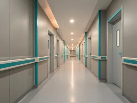
Designers often ask whether engineered wall sheets can feel as warm as painted drywall. The gallery’s answer is visual: textured finishes, coordinated rails, and carefully chosen neutrals keep spaces welcoming while protecting against carts. Prefabrication versus field-fit still matters for installation speed, but inspiration starts with seeing the finished corridor under realistic lighting before shop drawings freeze.
When sustainability goals push for higher recycled content percentage, the boards show how documented specialty products can still pair with warm woods and stone without looking institutional. Budget pragmatism remains real—so we highlight high-abuse zones first, where service life expectancy gains offset first-cost premiums faster than applying premium finishes everywhere. Natural-looking textures versus clearly engineered panels is another trade-off: some owners want invisible protection, others want a deliberate rail language that signals durability to staff and guests alike.
For education and civic projects, try pairing muted greens with soft oak millwork and matte corner guards so corridors feel calm after school hours. For hospitality, warmer ambers near Pedimat entries help luggage zones feel intentional instead of utilitarian. Office façade studies focus on blade pitch and shadow lines so sunshades read as architecture while mechanical teams still hit free area targets. Bring these boards to the finish meeting, then request physical samples for the two or three directions that survive the first round of owner feedback.
Request samples that match the inspiration sets above, or ask a specialist to curate a board for your building type.
Request a Sample